Ethereum is witnessing one of the sharpest crashes since the COVID crash. Nine consecutive red candles indicate the market’s fear and high selling pressure. The price has broken critical levels downwards, and it’s important to analyze key support levels.
Technical Analysis
By Grizzly
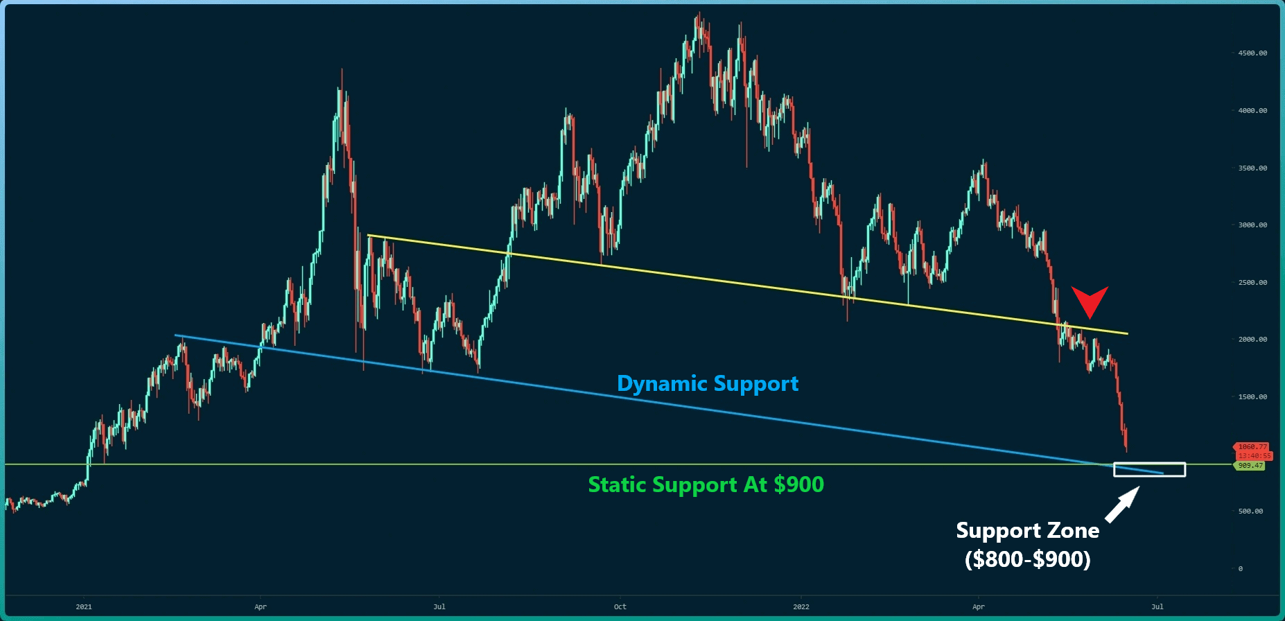
The Daily Chart
On the daily timeframe, after several attempts, buyers could not push the price above the yellow descending line, and a sharp downward trend started, which has printed nine consecutive red candlesticks so far.
As seen in the chart, the blue descending line with the green static support intersects at the point known as a Potential Reversal Zones (PRZ). This zone is currently in the range of $800-$900.
These points often have the potential to prevent negative momentum from intensifying further. If the bears push the price to this zone, there will probably be reactions from the bulls. In this scenario, one can expect the price to correct upwards – something that we can kind of see on the charts at the time of this writing.
However, confirming a bullish structure is near impossible until the price in this timeframe returns above $2,000.
Key Support Levels: $1000 & $900
Key Resistance Levels: $1300 & $1500
Moving Averages:
MA20: $1686
MA50: $2072
MA100: $22551
MA200: $2939
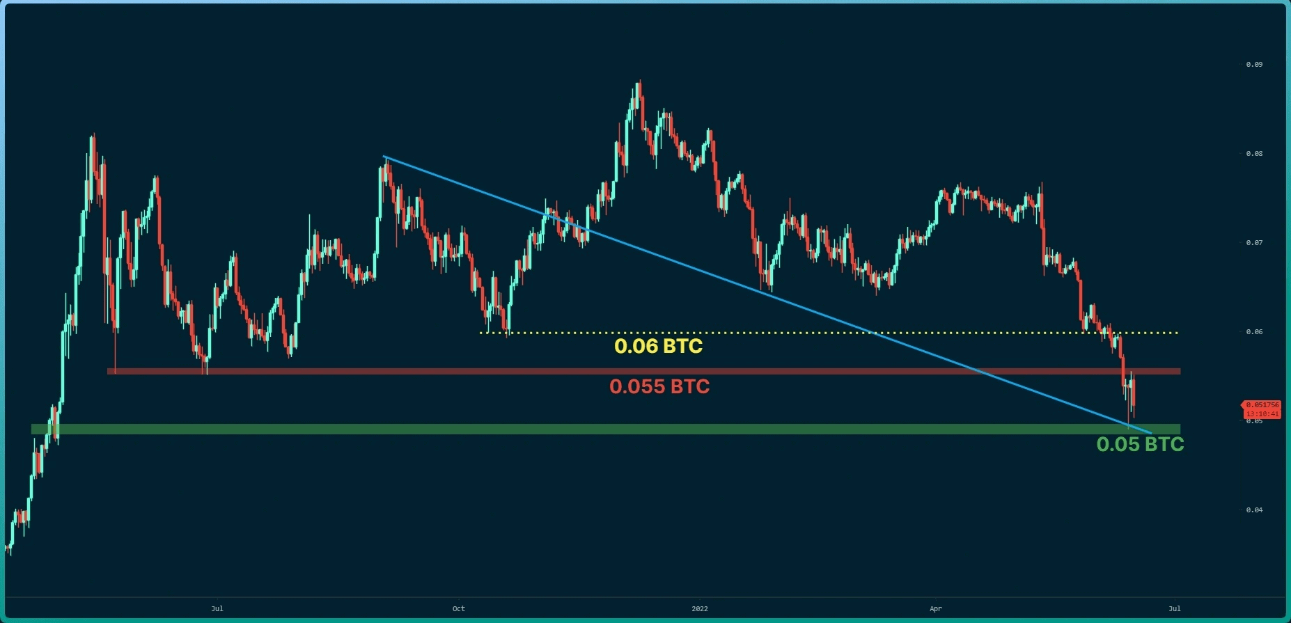
The ETH/BTC Chart
Against Bitcoin, the bulls are most likely to defend the support at 0.05 BTC. This zone is the intersection point of dynamic (in blue) and static support (in green). The volatility in this chart has been high in the last three days, and the formation of candlesticks with long bodies and shadows indicates the battle between the bulls and the bears. However, the price must be able to return at least above the level of 0.06 BTC to talk about the reversal of the trend.
Key Support Levels: 0.050 BTC & 0.0.045 BTC
Key Resistance Levels: 0.055 BTC & 0.06 BTC
On-chain Analysis
Exchange Netflow & Top10 Inflow – Coinbase Pro
Definition: Netflow: The difference between coins flowing into and out of the exchange. (Inflow – Outflow = Netflow)
Exchange Inflow (Top10): The total coins amount of the top 10 transactions inflow to the exchange.
Coinbase is known as a gauge of North American investors’ behaviour. It has been proven to play an essential role in the crypto market.
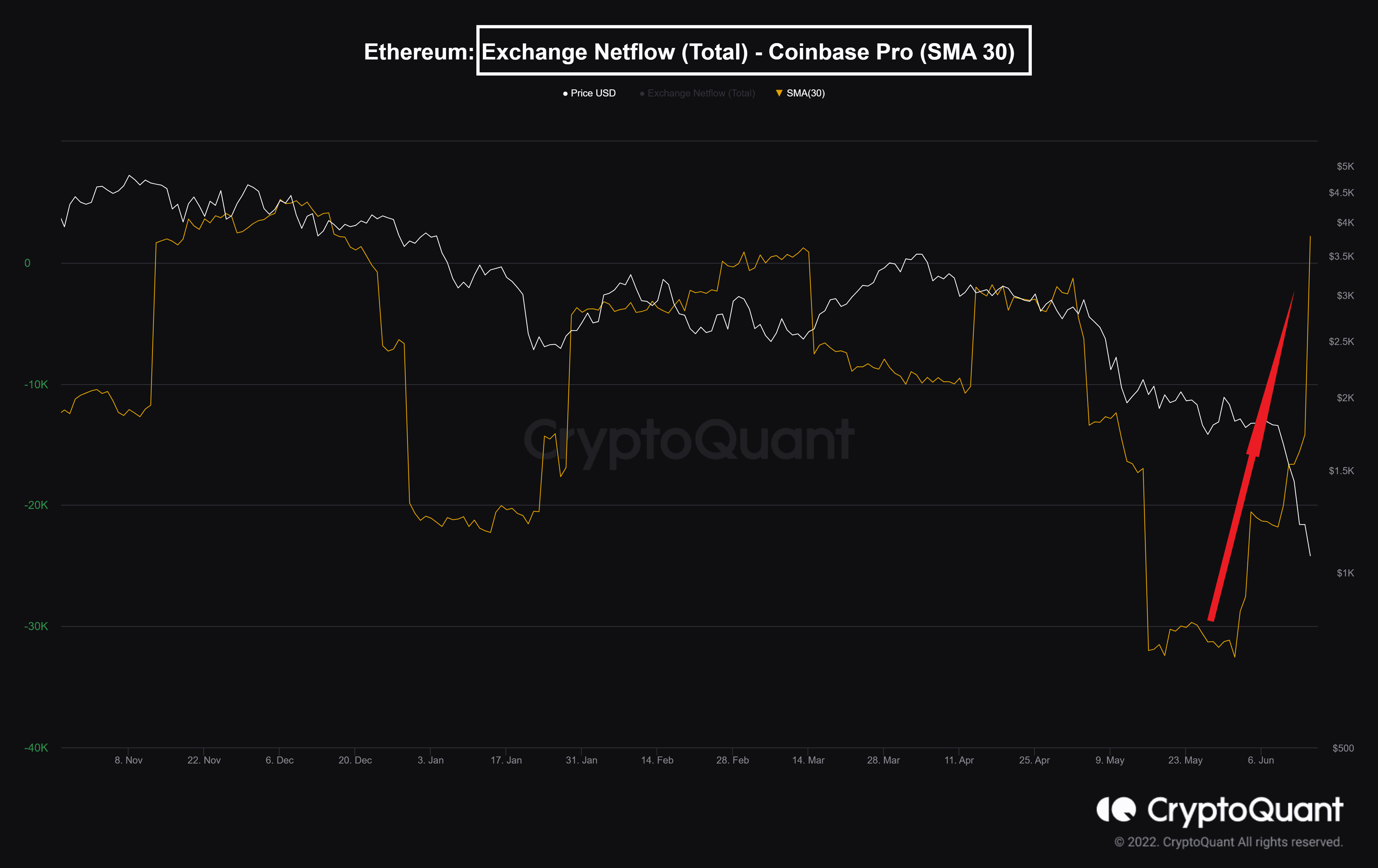
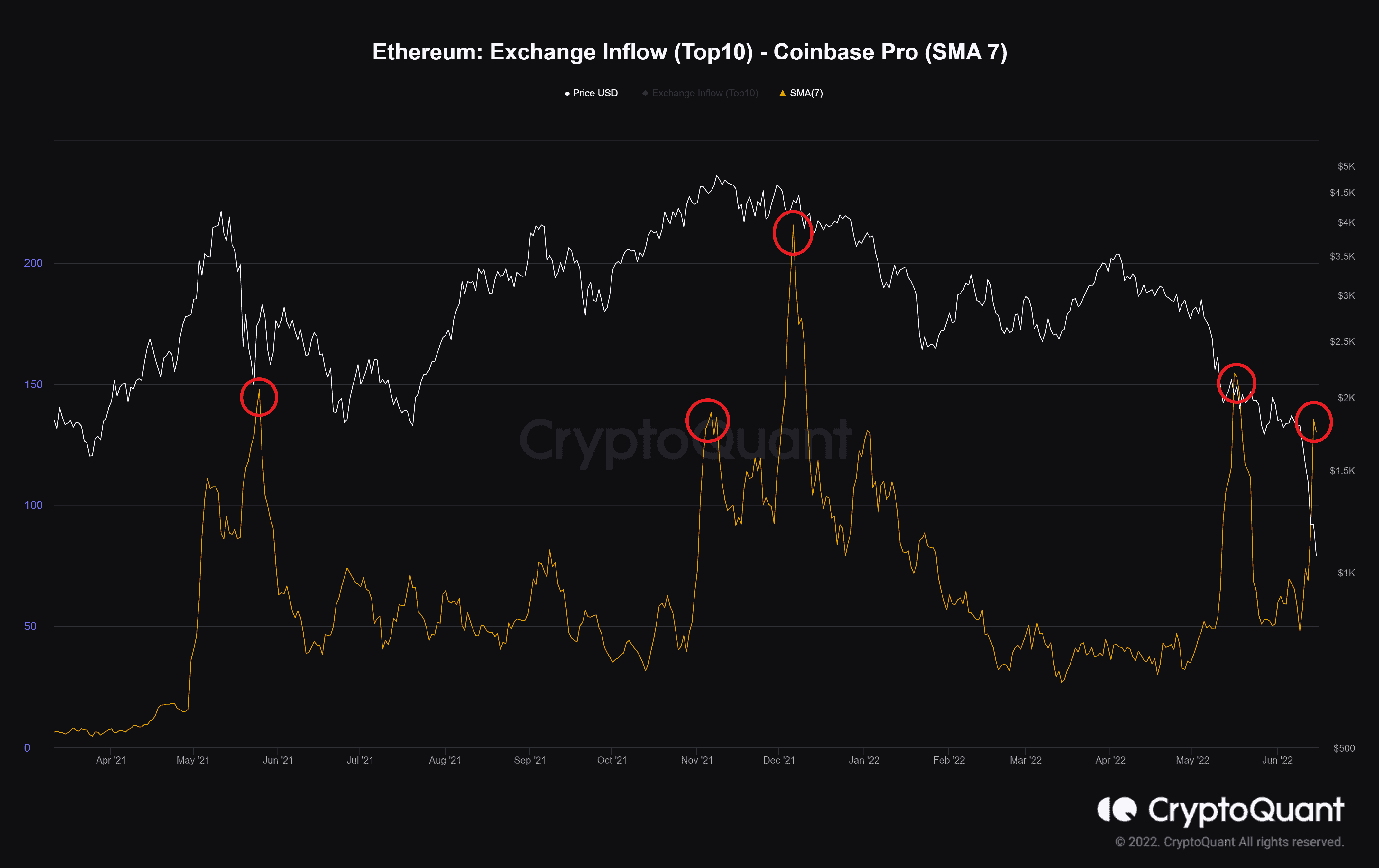
As can be seen from the charts, the NetFlow index has experienced a sharp increase, which shows that investors deposit their coins into the exchange with fear. Meanwhile, the second chart shows that the share of whales in this movement is high and increasing. This metric has often been accompanied by falling prices.
Binance Free $100 (Exclusive): Use this link to register and receive $100 free and 10% off fees on Binance Futures first month (terms).
PrimeXBT Special Offer: Use this link to register & enter POTATO50 code to receive up to $7,000 on your deposits.
Disclaimer: Information found on CryptoPotato is those of writers quoted. It does not represent the opinions of CryptoPotato on whether to buy, sell, or hold any investments. You are advised to conduct your own research before making any investment decisions. Use provided information at your own risk. See Disclaimer for more information.
Cryptocurrency charts by TradingView.
Source: https://cryptopotato.com/ethereum-price-analysis-eth-at-historical-support-this-is-the-next-key-level-to-watch/