Bitcoin’s price continues to consolidate in a tight range, as it failed to break a significant resistance level to the upside a few days ago. However, from a technical analysis standpoint, the time for a decisive breakout is near.
Technical Analysis
By: Edris
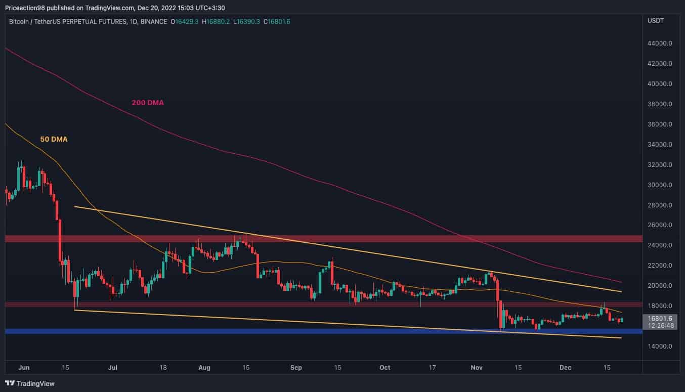
The Daily Chart
On the daily chart, the price is still consolidating in a large falling wedge pattern. These are commonly known as potential bullish reversal patterns in a bear market, provided they get broken to the upside.
However, last week’s rejection from the $18K resistance level and the 50-day moving average has halted the rally toward the higher boundary of the pattern. As a result, it likely initiated a drop down to the $15K support level and the lower trendline of the wedge.
Considering today’s bullish daily candle, a retest of the 50-day moving average currently located around the $17K mark seems likely. The short-term future of BTC’s price would be determined by the outcome of this attempt.
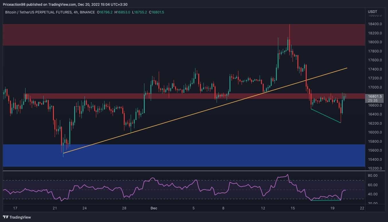
The 4-Hour Chart
Viewing the 4-hour timeframe, it is evident that the price is recovering but is experiencing major issues returning above the $16,800 level following last week’s plunge.
In the event of a break above the $16,800 level, a retest of the broken bullish trendline would be expected. On the other hand, the price’s failure to break above $16,800 would likely initiate a bearish continuation toward the key $15K area.
A recent short-term bullish move was signaled by the RSI indicator, as a clear divergence was formed between the last two price lows.
However, the oscillator is currently showing values around 50%, hinting at a neutral state in momentum and offering little clue on the probable direction of the trend in the short term as the market continues to witness a fragile equilibrium between buyers and sellers.
Onchain Analysis
By Shayan
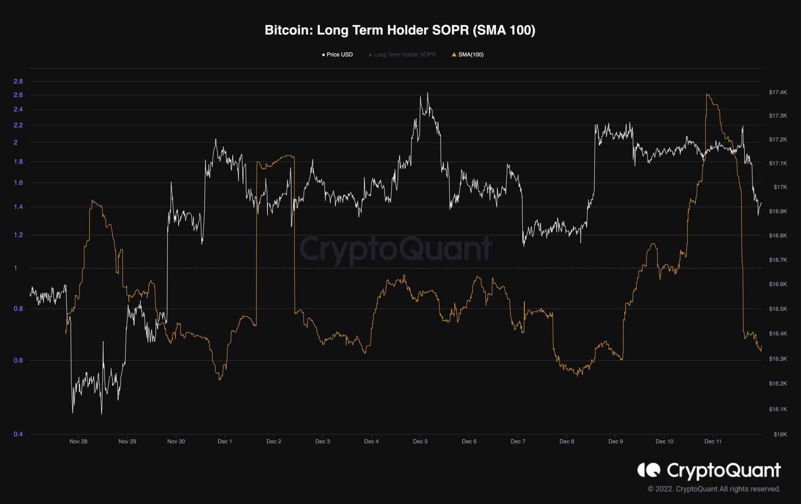
The following chart includes the Long Term Holder SOPR(Block resolution) and Bitcoin’s price.
Long-Term Spent Output Profit Ratio is a ratio of spent outputs (more than 155 days) in profit at the time of the window. Values over ‘1’ indicate more long-term investors are selling at a profit, while values below ‘1’ mean more long-term investors are selling at a loss.
The metric spiked three times during the price recovery from $16K to roughly $18.4K. Also, it has printed a significant jump after Bitcoin surged and reached the crucial resistance level of $18K.
This proves that long-term holders consider each price surge an opportunity to offload their assets and realize profits.
This is typical behavior during the late bear market stages; however, the next bull run won’t be initiated unless this cohort stops distributing their assets and start accumulating BTC with higher rates.
Binance Free $100 (Exclusive): Use this link to register and receive $100 free and 10% off fees on Binance Futures first month (terms).
PrimeXBT Special Offer: Use this link to register & enter POTATO50 code to receive up to $7,000 on your deposits.
Disclaimer: Information found on CryptoPotato is those of writers quoted. It does not represent the opinions of CryptoPotato on whether to buy, sell, or hold any investments. You are advised to conduct your own research before making any investment decisions. Use provided information at your own risk. See Disclaimer for more information.
Cryptocurrency charts by TradingView.
Source: https://cryptopotato.com/surge-to-18k-or-a-crash-to-15k-whats-more-likely-for-btc-bitcoin-price-analysis/